Customer Type Clustering
Background
Suppose I am a data engineer working in a giant supplier company. I have a bunch of supply records and my task is to figure out what types of customer are in my dataset. These records are customers annual spending amounts (in dollar) of different types of product categories. The dataset is available in my Github page.
Data Exploration
Let’s see if the data is loaded correctly
  data = pd.read_csv("C:/Github/Customers-Type-Clustering/customers.csv")
  data.drop(['Region', 'Channel'], axis=1, inplace=True)
  print "Wholesale customers dataset has {} samples with {} features each.".format(*data.shape)
  data.head(2) # also use data.describe() to check data summary (numeric only)
  data.isnull().sum()
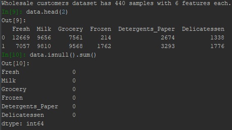
There are six product categories: ‘Fresh’, ‘Milk’, ‘Grocery’, ‘Frozen’, ‘Detergents Paper’, and ‘Delicatessen’. To get a better understanding of the dataset visually, I constructed a scatter matrix to each of the six product features.
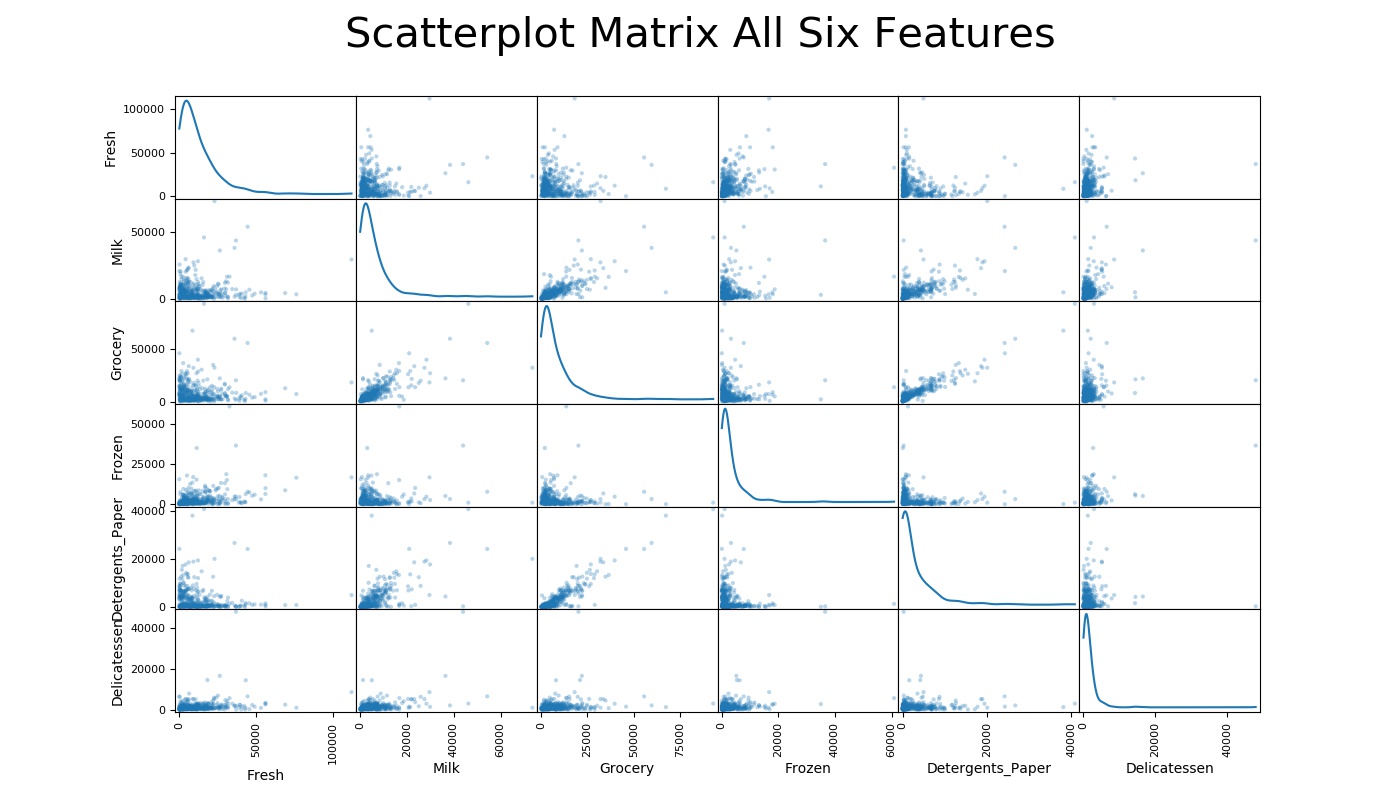
As shown in the graph, most data points are concentrated at 0; the density decreases as the spending amount increases. In addition, all features appear to be right skewed, meaning the majority of the data is on the lower values. This kind of skewness appears on Fresh vs Fresh, Milk vs Milk, etc. In addition, there are many outliers, which make the graph less obvious for us to see what exactly the distribution of the data is. If we somehow fixed those outliers, the distribution of the graphs might look more like a normal distribution, at least not as extreme.
Data Preprocessing
Data Transformation
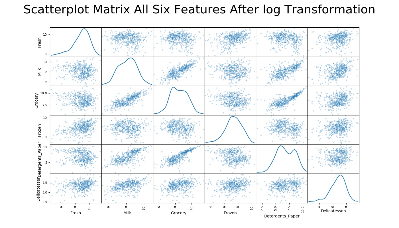
As observed, most categories are skewed to the right and contain outliers. I need to perform data transformation in order to neutralize the skewness and maximize the clustering algorithms performance. There are multiple ways to handle skewness in data, and applying natural logarithm to every data point is usually the best approach to handle right-skewed data.
  log_data = np.log(data)
  pd.scatter_matrix(log_data, alpha = 0.3, figsize = (14,8), diagonal = 'kde');
To filter out outliers, I use Tukey’s method: a data point will be considered as an outlier when it is 1.5 times the interquartile range(IQR). That is, I will consider the data point is an outlier if the value is below (Q1) – (1.5 × IQR) or above (Q3) + (1.5 × IQR), where Q1 is 25% percentile, Q3 is 75% percentile, and IQR is Q3 - Q1
Now we have cleaned the data, let take a look at how the data look.
Feature Transformation
Reducing the data dimensionality is often useful as it can draw clues about the underlying structure of the data. In this post, I am going to apply Principal Component Analysis, or PCA. PCA calculates the dimensions that best maximize variance, meaning I will be able to find which compound combinations of categories best describe customers.
  pca = PCA()
  pca.fit(good_data)
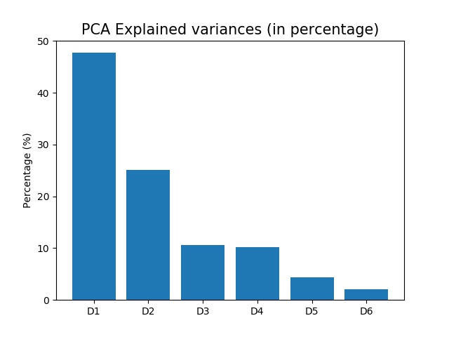
Dimension 1 explained 47.7% of the variance, while Dimension 2 explained 25.1% of the variance. If I include the first four dimensions, I will have explained 93.52% variance. In order words, I can drop two dimensions and only lose about 6% of the variance. Even though including more dimensions usually means I will have more information, reducing the dimensionality of the data can significantly reduce the complexity of the problem. As a result, I chose to only include the first two dimensions in this case, which represent 72.8% of total explained variance.
  pca = PCA(n_components=2)
  pca.fit(good_data)
  reduced_data = pca.transform(good_data)
  reduced_data = pd.DataFrame(reduced_data, columns = ['Dimension 1', 'Dimension 2'])
#Clustering
I choose to use K-mean clustering algorithm to identify the various customer types hidden in the data. One of the advantages of K-mean clustering is that it is hard clustering, meaning each data point has to belong to one cluster.
Determining the Number (K) of Clusters
Silhouette coefficient is a great tool for quantifying how many clusters we should include for this data. Silhouette coefficient measures how similar a data point is to its assigned cluster: 1 indicating the most similar, and -1 indicating the least similar. I then calculate the mean of the silhouette coefficients and select the number of clusters that has the highest mean to be our cluster.
for n in range(2,10):
    # Kth cluster range from 2 to 9
    clusterer = KMeans(n_clusters = n)
    clusterer.fit(reduced_data)
    preds = clusterer.predict(reduced_data)
    score = silhouette_score(reduced_data, preds)
    print "For cluster = {}, the silhouette score is {}".format(n, score)
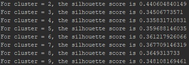
It turns out that two clusters are the best for this data. Let’s pull a sample from each segment randomly and see how they differ:

These two clusters definitely have a different distribution. According to the image above, segment 0 has more than double for fresh and frozen products compared to segment 1, while segments 1 spent a significant amount on Milk, Grocery, Detergents Paper, and Delicatessen. It is reasonable to assume that segment 0 could represent restaurants since it spent more money on Fresh and Frozen products. Segment 1, on the other hand, could represent supermarkets, or large grocery stores, because it spent a decent amount on every category, and its grocery is significantly higher than the mean as well as segment 0.
Conclusion
In this post, I explored how I turned a messy data into useful information by applying clustering techniques. There are many other ways to utilize unsupervised learning methods. For example, the newly created cluster can even be used as features in supervised learning models.
The Company can potentially run an A/B test on changes to those two groups (segment 0 and 1) and see whether one group would perform a better result than the other. If segment 0 is truly restaurants and segment 1 is supermarkets, the company can implement different strategies to better target restaurants/ supermarkets in order to increase their revenue.

